Wednesday, September 9, 2015

[P1]:4

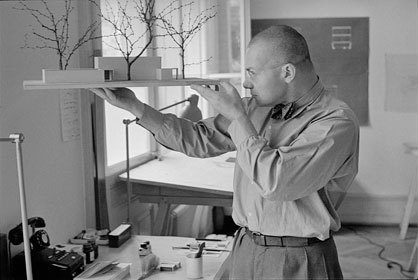
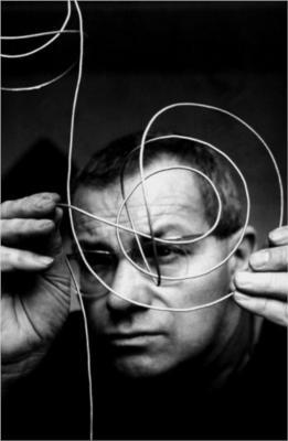
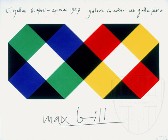
Max Bill was a Swiss architect, painter, typeface, industrial, and graphic designer. After designing and building his own house and studio he became a crucial member in the Allianz group of Swiss artists. Bill was considered one of the important influences on Swiss graphic design in the 1950′s.


Tuesday, September 8, 2015

[P1]:3

Adrian Frutiger is typeface designer who was a massive influence on digital typography in the late 20th century. His most popular typeface was Univers. Frutiger started off his early career by becoming an apprentice to the printer Otto Schlaeffli in Interlaken. He then studied at the Kunstgewerbeschule in Zürich, there he mostly practiced and perfected his calligraphy techniques. Frutiger was recruited to the Deberny & Peignot after his work caught Charles Peignot eye. He and Peignot worked together and challanged each other to push the boundaries of typeface. Taking influence from Akzidenz Grotesk, Frutiger developed his Univers font.


Image result for adrian frutiger work


Image result for adrian frutiger work
 
Image result for adrian frutiger work

Image result for adrian frutiger work

Monday, September 7, 2015

[P1]:2


For our first official exploration of type we were given a grid template and various fonts and sizes with which we cut out and glued in different orders and layouts across the grid. These are two of my favorite layouts. 

Wednesday, September 2, 2015

[Po], T1

combined with group (letter project)

Considered [Po], T1


Our first assignment was to find letters in nature or construct our how. I chose to make mine out of toilet paper, no specific reason there was just a sheet laying on my floor. The letters were very easy to construct so I forced myself to push the concept further and make them more interesting. When I uploaded the images and played around with editing I found that from far away, the letters looked kinda like glowing lanterns because of the layering of paper.