Wednesday, April 13, 2016

Speech Project


PALE BLUE DOT 

A speech by Carl Sagan 
Carl Sagan: American astronomer, cosmologist, astrophysicist, astrobiologist, author, science popularizer, and science communicator in astronomy and other natural sciences. 


He wrote this passage in his book about the picture that Voyager 1 space probe took of the earth one last time until it left our solar system.
After watching Sagan's show, The Cosmos, as a child and being raised to love the night sky, I have always been in love with his words. 
It wasn't until the recent remake of The Cosmos that I heard the combination of his voice narrate that quote and the visuals of Voyager 1 slowly moving away from earth. 
The feeling of this speech is nothing short of inspiring. It makes you reevaluate your life and what you thought was right and wrong.

Thursday, February 25, 2016

<p>Miller's Grammar wallpaper collection (2006) was based on repetition of typographic characters to create a densely woven texture.</p><p>"I think the phenomenon of branding has become oppressive. As 'brand' colonizes more and more experiences and places (and even some people who have achieved brand status) you get a zombie-like effect, a placelessness and over-determined experiences," Miller says.</p>


Branding has become Obsessive    As Miller sees it, design is about creating narratives, not just beautiful shiny objects. People loose sight of whats important because they are too busy worrying about the brand and the reputation at stake. With the recent explosion of technology and social media, it has become accustomed to see brands and identities every time you log in. "Before, you had to argue the value of design
to a client. Now, it’s almost the opposite.Branding is almost too well-regarded." 


Tuesday, February 2, 2016


What are the advantages of a multi-column grid?  
Multi column grids provide flexible formats for publications that have a complex hierarchy or that integrate text and illustrations. The more columns you create, the more flexible your grid becomes. 

How many characters is optimal for line length? 
The optimal line length is considered to be 50-60 characters long, including spaces. 

Why is the baseline grid used in design?
 Baseline grids serve to anchor all (or nearly all) layout elements to a common rhythm 

What are reasons to set type justified? ragged (unjustified)? 
Justifying text allows the page to appear more organized and structured.  

What is a typographic river?
When justifying text, large spaces in between text start to form and they connect from line to line creating a "river" look throughout the paragraph. 

What does clothesline, hang-line or flow line mean? 
Hang-line is when body text can "hang" from a common line. 


Monday, February 1, 2016

Sunday, January 24, 2016


                                                                     History of Designers  


Fred Woodard- His style can be described as expressive and eccentric. Woodard kept Rolling Stone fresh and relevant with every new spread that came out, which was almost 400 issues. “Woodward and his talented staff have set a new standard for what editorial design can be, in what must be one of the longer hot streaks in magazine design history. Surveying his work, one is struck not just by its formal beauty and appropriateness, but by the sheer virtuosity of its design responses.”
—Michael Bierut, The New Edition of Design Exchange


Gail Anderson- She appreciably contributed to the widespread eclectic typographic fashion that prevailed throughout the 1990s but never fell into a style trap. For much of her tenure at Rolling Stone, working with art director (and AIGA Medalist) Fred Woodward, she fine-tuned her typographic expressionism in a cramped office filled floor to ceiling with all kinds of stimulating scraps, devising quirky letterforms out of traditional and untraditional materials, from hot metal and wood type to twigs and bottle caps. From this typographic wellspring came an ever-expanding vocabulary of signs and symbols, methods and mannerisms that, in turn, influenced a slew of designers who followed (and at times copied) her graphic eccentricities.


MD_Anderson_NewType_640


 Tibor Kalman- Kalman became founding editor-in-chief of the Benetton-sponsored Colors magazine in 1990. In 1993, Kalman closed M&Co and moved to Rome, to work exclusively on the magazine. Billed as 'a magazine about the rest of the world', Colors focused on multiculturalism and global awareness. This perspective was communicated through bold graphic design, typography, and juxtaposition of photographs and doctored images, including a series in which highly recognizable figures such as the Pope and Queen Elizabeth were depicted as racial minorities


Alexi Brodovitch- Alexey Brodovitch is remembered today as the art director of Harper's Bazaar for nearly a quarter of a century. But the volatile Russian emigrĂ©'s influence was much broader and more complex than his long tenure at a fashion magazine might suggest. He played a crucial role in introducing into the United States a radically simplified, “modern” graphic design style forged in Europe in the 1920s from an amalgam of vanguard movements in art and design. Through his teaching, he created a generation of designers sympathetic to his belief in the primacy of visual
freshness and immediacy.


Neville Brody- As the Art Director of Fetish he began experimenting with the beginnings of a new visual language that consisted of a mixture of visual and architectural elements. Later he was able to put these ideas into practice and to set new precedents through the innovative styling of The Face magazine (1981-1986). It was his work on magazines that firmly established his reputation as one of the world’s leading graphic designers. In particular, his artistic contribution to The Face completely revolutionised the way in which designers and readers approach the medium. Though Brody rejected all commercialisation of his graphic style, his unique designs soon became much-imitated models for magazines, advertising and consumer-oriented graphics of the eighties.


David Carson- Typography spun into a whirling end-of-century gyre in the 1990s, and David Carson was at its center. The incendiary pages of Ray Gun magazine inflamed the eyes and minds of countless young designers who sought to tap into the freedoms unlocked by his bold new style. Carson shaped everything in his path for his own purposes, endlessly contorting type, layout and grid into new configurations and abandoning design’s established truths of order and legibility. He represented a new breed of visual author.


Saturday, December 5, 2015

[P4]:4

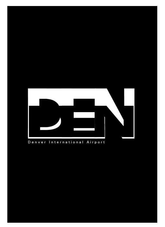
Now its down to deciding between these four DEN logos  


Tuesday, December 1, 2015

Wednesday, November 18, 2015

[P4]:2

                                       
                                             30 analog typographic marks for Denver or DEN


Tuesday, November 17, 2015

[P4]:1


                                                                      Denver, Colorado
                                                                         DEN Airport
                                         Thirty typeface with characteristics relating to Denver


Wednesday, October 28, 2015

[P3]:2


Didot 
small capitals are designed to match the x-height of the lowercase letters. 
Ligatures are used to connect two letters in a typeface to make them appear more seamless, common ligatures are Ls and Fs. A typeface that uses ligatures is Diotima. 
Apostrophes are used for quotes and foot marks are used to indicate measurements and time. 

Here are some of my (still in the making) designs for my Didot posters 


Monday, October 19, 2015

P[3]:1


                                                  Didot 

Serif
Firmin Didot
1781
Modern
roman,italic and bold

Modern classification- style developed in the late 18th century that is characterized by high contrast between thick and thin strokes and flat hairline serifs.

High contrast
Abrupt serifs
vertical axis
horizontal stress
small aperture

Old Style: The roman typefaces of the fifteenth century emulated classic calligraphy. Sabon, Bembo, and Garamond are examples of Old Style.
Transitional:Sharper serifs and more vertical axis. Examples: Baskerville, Bookman, and Clearface.
Modern: Designed in the late 18th century and are radically abstract, sharp contrast. Examples: Bodoni, Didot and Ambroise.
Slab Serif: Bold and decorative introduced in the 19th century. Ex: Clarendon, Gaspar and Josefin.
San Serif: Common in the 20th century has humanist characteristics. Ex: Gill Sans, Bebas and Intel.
The main diagonal portion of a letterform such as in N, M, or Y is the stroke.
 An imaginary line drawn from top to bottom of a glyph bisecting the upper and lower strokes is the axis. For typefaces that exhibit changes in the thickness of curved strokes, the inclination of the axis of the lowercase o is used to measure the angle of stress.
Small Caps: are designed to match the x-height of lowercase letters.
Ligatures: Two or more letters combined into one character
Lining figures: capital letters in that they are uniform in height, and generally align with the baseline and the cap height.
Type measurements: 1 inch= 6 picas= 72 points


Wednesday, October 14, 2015

[P2]: Final


I really struggled on developing a typeface on fontstruct. I was trying too hard to make everything so perfect and aligned that I ended up hating every font I had created. So I ditched the idea that my type had to look a certain way and started playing around. I created one typeface really fast and sloppily just for fun and I ended up really liking it. I reminded me of the messy, chaotic time period that was the 90's. I decided that would be my theme so I started to pull images and ideas that related to the 90's. I used images of TV static, pixelated skateboards , and Nirvana concert photos.

Sunday, September 27, 2015

[P2]:2

My font, "Phonte", used to spell out various words that you might see in the real world used for signage or labels. Phonte can be described as static, creepy or pix-elated.

Wednesday, September 23, 2015

[P2]:3

My second font, named Phonte, needs some refining but overall I enjoy the sloppiness of the typeface. It's almost reminding me of a late night teen TV program from the 90's.

Sunday, September 20, 2015

[P2]:2


First attempt at designing a typeface on FontStruct

Thursday, September 17, 2015

[P2]:1


Garamond:
is a group of old-style serif typefaces designed by a Parisian named Claude Garamond in the 16th century. Garamond type is best known for its readability. Most novels and poems we've read in garamond without noticing. 


Serifa:
is a slab serif typeface family created by Adrian Frutiger in 1964. It is based of the Univers family.
Sample Serifa typeface.tif

platlet:
is a typeface inspired by license plates. Its was designed by Conor Mangat in 1993.