Now its down to deciding between these four DEN logos
Saturday, December 5, 2015
Tuesday, December 1, 2015
Monday, November 23, 2015
Wednesday, November 18, 2015
Tuesday, November 17, 2015
Wednesday, October 28, 2015
[P3]:2
Didot
small capitals are designed to match the x-height of the lowercase letters.
Ligatures are used to connect two letters in a typeface to make them appear more seamless, common ligatures are Ls and Fs. A typeface that uses ligatures is Diotima.
Apostrophes are used for quotes and foot marks are used to indicate measurements and time.
Here are some of my (still in the making) designs for my Didot posters
Monday, October 19, 2015
P[3]:1
Didot
Serif
Firmin Didot
1781
Modern
roman,italic and bold
Modern classification- style developed in the late 18th century that is characterized by high contrast between thick and thin strokes and flat hairline serifs.
High contrast
Abrupt serifs
vertical axis
horizontal stress
small aperture
Old Style: The roman typefaces of the fifteenth century emulated classic calligraphy. Sabon, Bembo, and Garamond are examples of Old Style.
Transitional:Sharper serifs and more vertical axis. Examples: Baskerville, Bookman, and Clearface.
Modern: Designed in the late 18th century and are radically abstract, sharp contrast. Examples: Bodoni, Didot and Ambroise.
Slab Serif: Bold and decorative introduced in the 19th century. Ex: Clarendon, Gaspar and Josefin.
San Serif: Common in the 20th century has humanist characteristics. Ex: Gill Sans, Bebas and Intel.
The main diagonal portion of a letterform such as in N, M, or Y is the stroke.
An imaginary line drawn from top to bottom of a glyph bisecting the upper and lower strokes is the axis. For typefaces that exhibit changes in the thickness of curved strokes, the inclination of the axis of the lowercase o is used to measure the angle of stress.
Small Caps: are designed to match the x-height of lowercase letters.
Ligatures: Two or more letters combined into one character
Lining figures: capital letters in that they are uniform in height, and generally align with the baseline and the cap height.
Type measurements: 1 inch= 6 picas= 72 points
Wednesday, October 14, 2015
[P2]: Final
I really struggled on developing a typeface on fontstruct. I was trying too hard to make everything so perfect and aligned that I ended up hating every font I had created. So I ditched the idea that my type had to look a certain way and started playing around. I created one typeface really fast and sloppily just for fun and I ended up really liking it. I reminded me of the messy, chaotic time period that was the 90's. I decided that would be my theme so I started to pull images and ideas that related to the 90's. I used images of TV static, pixelated skateboards , and Nirvana concert photos.
Sunday, October 4, 2015
Monday, September 28, 2015
Sunday, September 27, 2015
[P2]:2
My font, "Phonte", used to spell out various words that you might see in the real world used for signage or labels. Phonte can be described as static, creepy or pix-elated.
Wednesday, September 23, 2015
[P2]:3
My second font, named Phonte, needs some refining but overall I enjoy the sloppiness of the typeface. It's almost reminding me of a late night teen TV program from the 90's.
Sunday, September 20, 2015
Thursday, September 17, 2015
[P2]:1
Garamond:
is a group of old-style serif typefaces designed by a Parisian named Claude Garamond in the 16th century. Garamond type is best known for its readability. Most novels and poems we've read in garamond without noticing.

Serifa:
is a slab serif typeface family created by Adrian Frutiger in 1964. It is based of the Univers family.

platlet:
is a typeface inspired by license plates. Its was designed by Conor Mangat in 1993.

Wednesday, September 16, 2015
[P1]:Final
Phase 1
Phase 2
Phase 3
https://www.behance.net/alexwieselman
Phase 2
This project required us to explore the different ways of arranging text on a grid. This was done in three phases. The first phase was a more hands on approach. We were given a set of words in different sizes and boldness. We arranged them in different patterns, keeping hierarchy in mind, 15 ways and taped them to the grid. Phase two was the same except we were to do a digital version on the computer. We also were allowed to add color and rules. Finally phase 3 was an exploration of over sized type. We were allowed to make any word or letter as large as we wanted.
https://www.behance.net/alexwieselman
Sunday, September 13, 2015
[P1]:4
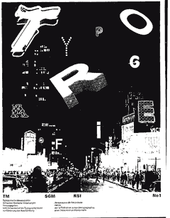
Wolfgang Wiengart is a German graphic designer and typographer. He is known as the "father" of New Wave or Swiss Punk typography. He met his mentor, Karl-August Hanke, at his three year apprenticeship in hot metal hand composition at Ruwe Printing. According to Weingart, "I took 'Swiss Typography' as my starting point,
but then I blew it apart, never forcing any style upon my students. I
never intended to create a 'style'.



Wednesday, September 9, 2015
[P1]:4
Neville Brody is an English typographer, art director, and graphic designer. Brody was in print school when 1970's rock culture was becoming popular. He was very moved by it and applied it to his designs. He made a name for himself by becoming a successful art director for The Face magazine. In 1994, with his business partner Fwa Richards, launched their own design practice: Research Studios.


[P1]:4
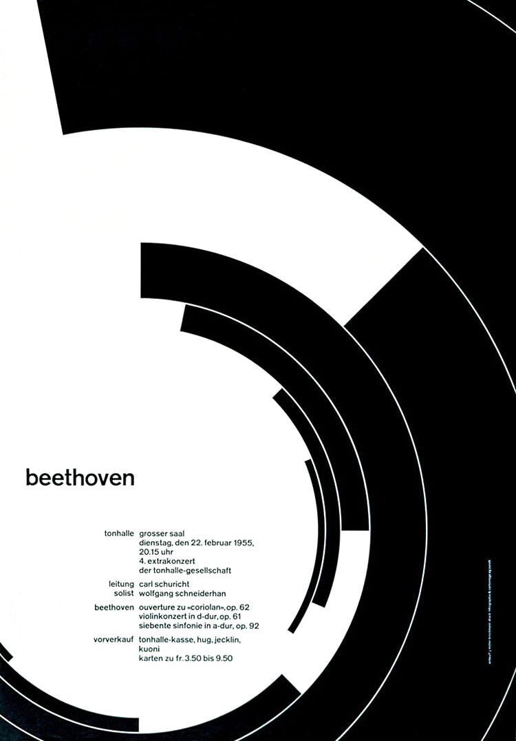
Josef Müller Brockmann was a Swiss graphic designer. He studied architecture and design at the Kunstgewerbeschule in Zurich. In 1936 he open his own graphic design and photography studio in Zurich. In the 60's, Brockmann was appointed European design consultant to IBM. He is also well known for his published books on design and visual communication.



[P1]:4
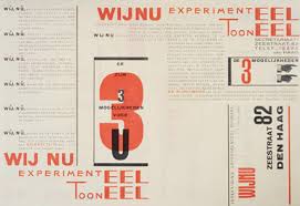
Piet Zwart was a Dutch photographer and typographer. He trained as an architect, which also included designing furniture and interiors. His architectural style evolved toward a more functional design after he worked with De Stijl. He began his graphic design career at age thirty-six. He realized how important typography was for the 20th century, so he decided to change it.



Subscribe to:
Comments (Atom)


